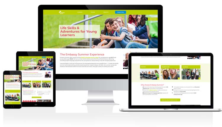
Embassy Summer website refresh

Project highlights
- Project management
- Product ownership
- UX
- SEO
- CRO
Scroll down for the case study, or...
Jump to the project gallery
Project brief
The client, who operated English language summer camps for children and teenagers, needed a website overhaul. Their current website, while functional, suffered from content inaccuracy, low traffic volumne due to poor technical SEO, and lacked the appeal to drive student enrolments.
Working as Website and Design manager for the parent company of the brand, I was the designated Product Owner for this website alongside 3 others.
My goal was to craft a website that provided clear and up-to-date information while engaging the target audience and converting them into paying customers.
Client feedback
Claire played a vital role in positively transforming Embassy Summer marketing. In particular Claire has improved our website in terms of its design, useability and content, which has led to increased traffic.
- Ben Reynolds, Global Director at Embassy Summer, LinkedIn.
Understanding the Problem
Recognizing the need for a swift yet impactful solution, I employed UX triangulation to understand the website's shortcomings. This involved a multi-pronged approach that combined heuristic evaluation, user research, data analysis, and competitor benchmarking.
- User research: I launched a survey to capture user insights, helping me to understand who the audience was. The survey was advertised on the website itself, through marketing emails, and across social media channels.
- Data analysis: I implemented Event Tracking via Google Tag Manager, to gain insights into user behavior on the website.
- Competitor benchmarking: An SEO audit was conducted to identify areas for improvement in search engine optimization. Additionally, a competitor benchmark report was compiled to understand the strengths and weaknesses of similar summer camp websites.
- Heuristic evaluation: I evaluated the existing website against best practices and web standards (eg considering accessibility shortfalls, clarify of user feedback in error messages, consistency of layout and design, etc)
Through this approach I was able to pinpoint the key areas that required the most urgent attention within the limited timeframe allocated for the project. This comprehensive approach ensured I wasn't just relying on a single source of information, but rather building a well-rounded picture of the website's effectiveness.
Identified website problems:
- Accessibility issues: The color scheme relied heavily on red and green, making it difficult for users with color blindness.
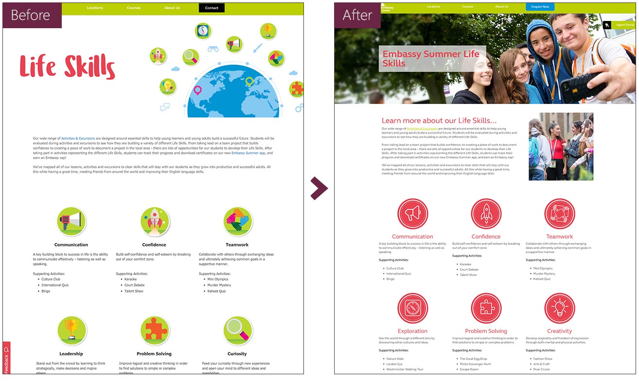
- SEO and user experience problems: Lack of proper h1 markup with page titles presented as oversized images with no alt tags. Inline styling on content sections led to slow loading times and design inconsistencies.
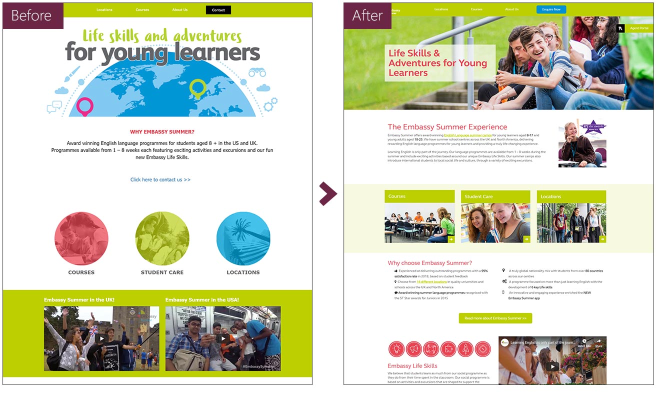
- Homepage issues: Unclear calls to action and a confusing layout resulted in a high bounce rate.
- Content prominence: Key information was hidden within collapsible sections, hindering user engagement.
- Visual inconsistency: The website's visual style did not align with the brand's printed materials and skewed towards a younger audience than the target demographic.
Designing the solution
Limited resources and tight deadlines demanded a strategic approach to website improvement.
Instead of a complete overhaul, as the product owner for the website I focused on delivering high-impact changes that would yield the most significant results. This iterative approach laid the groundwork for future enhancements while delivering immediate benefits.
Accessibility was a top priority. The existing color scheme, which relied heavily on red and green and was not negotiable with the client, created challenges for users with color blindness. I addressed this by adjusting how it was used, to create a more accessible user experience.
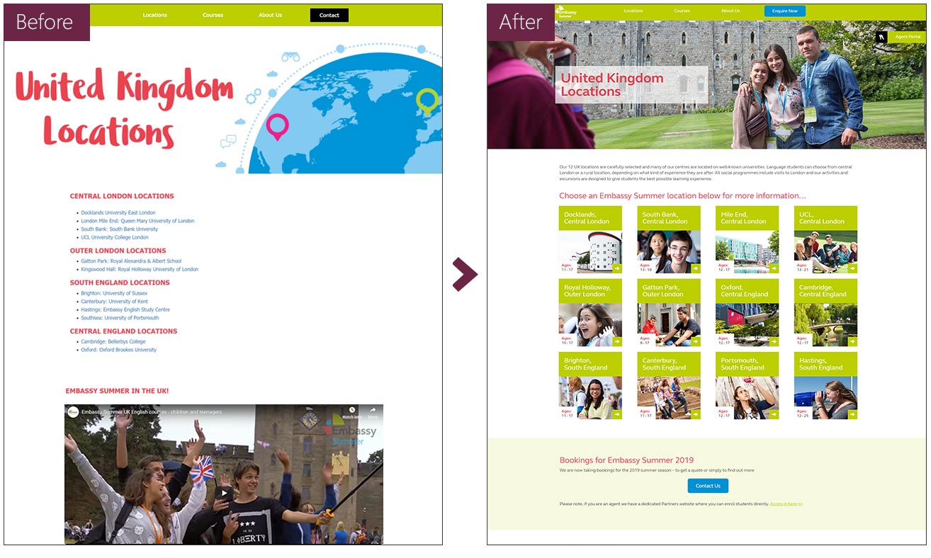
As the product owner for the website, I championed a user-centric approach. In addition to addressing accessibility problems, I improved technical SEO, and restructured camp location pages for clear information access. Additionally, a homepage redesign prioritized clear calls to action and highlighted the brand's value proposition.
Visual consistency across brand channels was achieved by aligning website iconography with printed materials, and each page was updated with factual content revisions in order of priority with the most frequently visited pages being updated first.
Finally, leveraging existing photoshoot materials, I revamped the website's visual style for a more age-appropriate and visually appealing look that resonated with the target demographic.
Effective project management was crucial due to the development team's location in Australia. I created detailed briefs and wireframes for template and technical updates, communicated clearly via email and Skype calls, and maintained clear organization to overcome the time zone difference. This ensured the project stayed on track and delivered a website exceeding the client's expectations.
Project outcomes
- Improved website accessibility by addressing color contrast issues.
- Enhanced SEO by incorporating h1 markup and optimizing page titles.
- Increased user experience by improving content organization and navigation.
- Reduced bounce rate by providing clear calls to action and highlighting key information on the homepage.
- Achieved visual consistency between the website and printed materials.


