Andorra digital marketing campaign

Project highlights
- UI design
- Front end development
- Email marketing
- Joomla! CMS integration
Scroll down for more information about the brief and design process, or...
Jump to the project gallery
Project brief
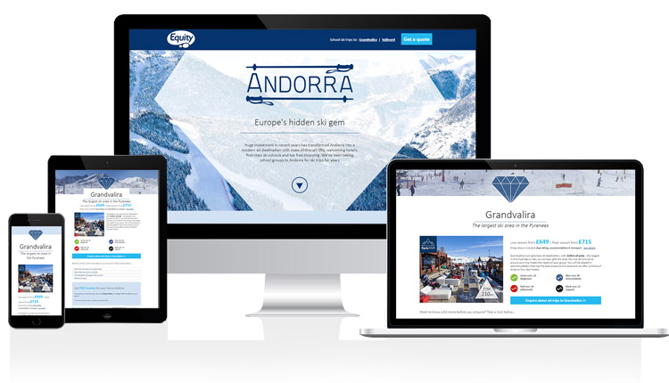
The client required design and build of a landing page and responsive email, to support a marketing campaign promoting Andorra.
The design process...
A printed booklet promoting ski trips to Andorra had already been created when this project was briefed to me, and I had a firm deadline of one week in which to design, build and test the landing page before the printed collateral hit the market.
The primary goal of the landing page was lead capture, as there was no online booking system in place due to the business set-up. There were two specific resorts in Andorra being promoted, around an overall campaign theme 'Europe’s hidden ski gem' and this informed the design of the campaign. A secondary requirement of the project was to showcase specific imagery.
Client feedback
I would highly recommend Claire to any potential employer. She is a pleasure to work with and always has a positive, can do attitude.
- Kate DiPompo, Ski Brand Manager at Equity LinkedIn.
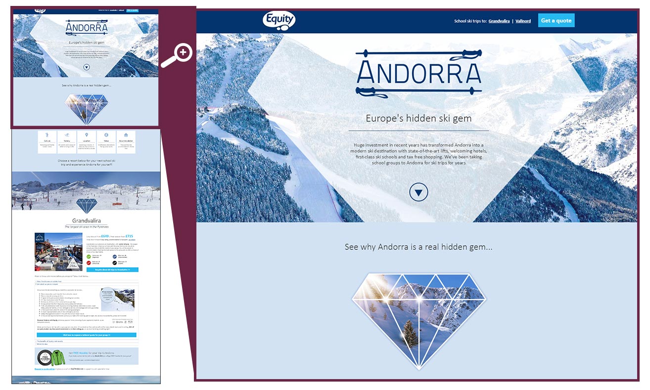
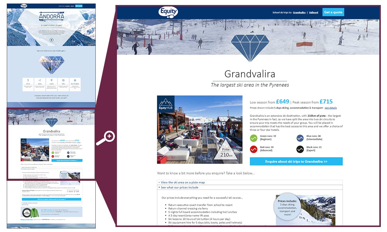
A large amount of information needed to be displayed for each report, and the campaign needed to be one page. To keep the UI as visually engaging as possible, I structured the content into 5 sections; a hero image section (with rotating background slideshow) featuring some basic introductory text and a scroll down arrow, a facts sections promoting the key USPs for the client, a lead capture form section, and two resort sections (one per resort) detailing prices, imagery and information - these resort sections utilised collapsible content areas detailing specific information per resort, but on load only displayed teaser information and imagery.
The UI of the page displayed a constant call to action in the form of a sticky header enquiry button - when the user clicked this the pae would auto-scroll to the lead capture form - when the user reached this point, either through clicking or natural scrolling, the enquiry button was set to hide, so that the submit button attracted the most attention. The form was kept minimal in order to encourage as many conversions as possible.
As this project was on a very short deadline, no digital wireframes were created, however a basic sketch of the intended lay out was made and talked through with the client before build - once this was approved, I coded the skeleton of the page using HTML/CSS, and then modified the code to integrate it with a PHP based CMS called Joomla. As soon as this was set up on the CMS I content populated the page.
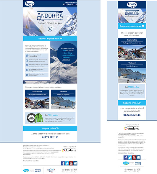
When creating the marketing emails to support this campaign, the key content was provided to me, and I based the design to match the landing page the customer would be clicking through to, for consistency in the customer journey. Certain elements were stripped out on mobile to ensure all key calls to action were prominent and uncluttered.
Project gallery
Click on an image below to enlarge it...


