Adrennial

Project highlights
- Research
- UX Design
- UI Design
- Product Design
- Mobile app design (iOS)
Scroll down to discover the process, or...
Jump to the project gallery
Project brief
Adrennial is a social video app focused on adventure, travel, outdoor living, and alternative lifestyles.
I joined the team as a UX Designer to focus on optimizing the user experience of their B2B product Focus - a SaaS video publishing application aimed at their Vision Partners (social influencers and video content creators.) In parallel, I was asked to design and support launch of their iOS mobile app 'Adrennial' aimed at video content consumers with a passion for outdoor lifestyles, working within an agile and multidisciplinary engineering team.
The business need was to increase revenue and reach for the brand, by encouraging Vision Partners to complete Focus onboarding and increase video content generation, while attracting a higher subscriber volumne to the B2C app Adrennial.
The design process...
Upon joining the team I spoke to key stakeholders such as Heads of Product, Engineering and Partner Outcomes, to learn what the existing challenges were, and develop a short and long term strategy to deliver value while addressing them.
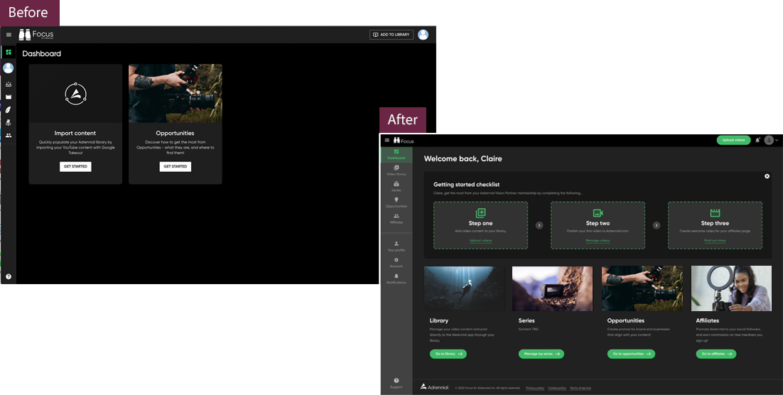
The first challenge was improving satisfaction and product ease of use for Vision Partners, the video content creators and social influencers who were using Adrennial as a platform to showcase their work to encourage more onboarding completions and reduce churn on the SaaS product Focus. There was also a desire from stakeholders to update the visual appeal of the UI to be more inline with current visual branding.
Client feedback
Claire has a keen eye for identifying user pain points. She excelled at aligning these insights with the customer journey to drive strategic improvements. Her contributions refined our product flows and improved user conversion.
- Steve Plummer, CEO at Adrennial LinkedIn.
Defining the problem for Focus...
Initially, the project involved spending time understanding user concerns that had been captured by the Partner Outcomes team, then conducting first-hand research which included user interviews with selected Vision Partners in order to build up a picture of user satisfaction and expectations.
I also spent time looking at competitor products from both a Creator and Consumer user perspective, and launched a survey targeting users of these products to understand what they liked and disliked about those tools, alongside what product functionality the creators considered important for their success and revenue generation.
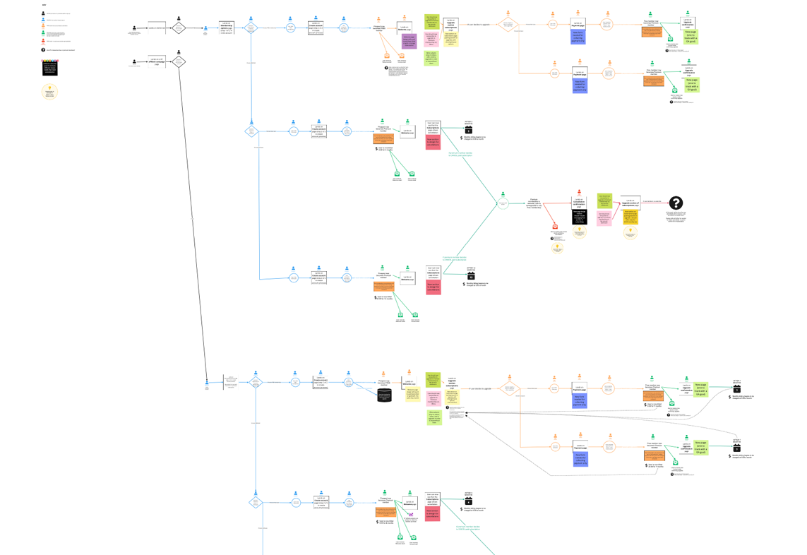
As well as looking externally, I conducted a design review of the existing platform, mapping out the existing user flows for key tasks and onboarding, to see where opportunities lay for optimising the UX.
Issues identified included;
- Low onboarding completion rates due to a lengthy process
- Low conversion rates for key product tasks
- Accessibility issues
- User pains in managing large volumes of content
- User facing language on the UI that did not make sense to users
- A desire from Vision Partners to see improvement in the B2C app where their published content was consumed by subscribers

Mapping the onboarding user flow
Identifying the solution
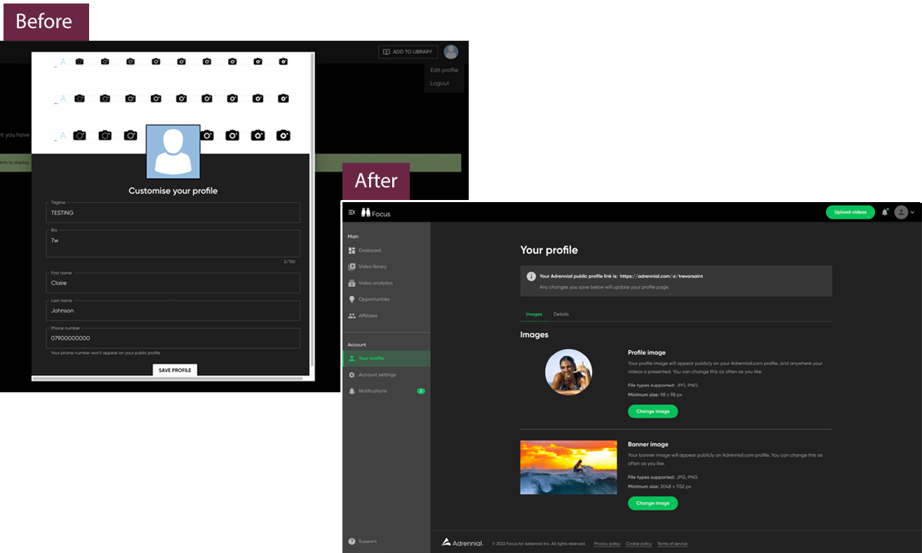
Working collaboratively with the Engineering and Product team, it was agreed to redesign rather than iterate on the existing platform, in order to ensure a consistent rollout of the branding updates whilst iteratively making continuous updates to some of the usability issues that impacted conversion and satisfaction.
Upon defining acceptance criteria with key stakeholders, design work began to address the problems identified by simplifying the onboarding journey, addessing accessibility through the branding updates, simplifying user facing microcopy and enhancing the content management dashboard.

Mobile app creation
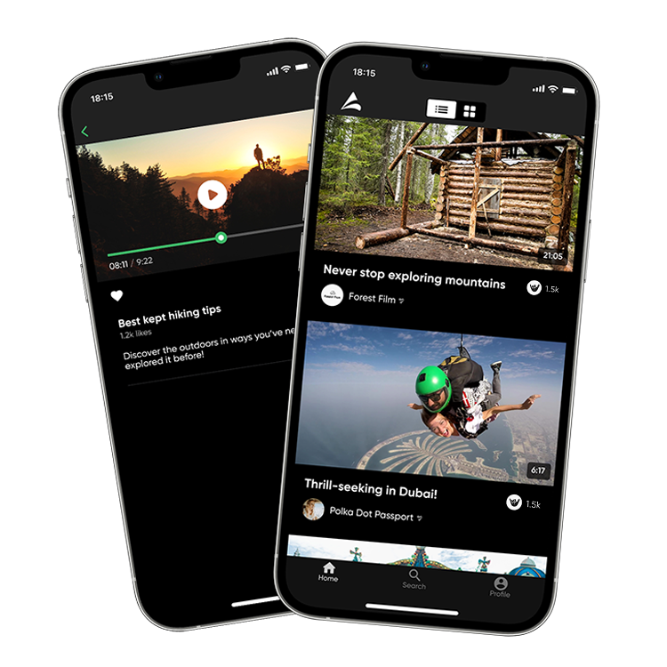
Attention now focussed on the B2C product, which at the time was in Alpha release. The desire from the C-Suite was to launch an iOS mobile app within a 6 week timeframe, in order to meet expectations of the Vision Partners and boost user subscriptions.
Working closely with a Swift Developer, UI Designer and Product Manager, I set out to understand the user personas and their needs from the app alongside expectations from our stakeholders and technical limitations of the brief.
Taking on board existing discoveries from competitor analysis and user knowledge, I wireframed and mapped key task flows for the app, working alongside another UI designer on creation of a high-fidelity prototype for pre-launch usability testing.

Working within a tight timeframeI made sure to identify and focus resource where most value could be generated from the app design, considering how best we could encourage product adoption through the app onboarding process, alongside social engagement and personalisation hooks to reduce abandonment.
Validating the concept
When I joined, Adrennial had not invested in any usability testing, so I worked with the team to assess different solutions and created a business case for investment, securing spend for recruitment of user test participants that matched our target personas and involving Engineers and Product in the discovery process.
Utilizing the insights from usability testing the first iteration of the app was released, and I then supported the creation of marketing assets for its commercial promotion and monitoring app performance while supporting iterative release of new updates.

Improving conversion rates for subscription
Once the mobile app launched, attention turned to reviewing the React based marketing website which also provided the Alpha version of the app.
Working with Product and Marketing stakeholders I mapped out the overall Customer Experience journey for users against the marketing lifecycle journey from prospect to converted customer, identifying opportunities to improve brand consistency in messaging, whilst driving prospects towards sign-up, also getting into place a Google Analytics reporting dashboard and ensuring it tracked conversions alongside other UX metrics.
Some of the conversion rate opportunities identified through heatmap tracking and data analysis included gaining an understanding of common friction points in the form, and enhancing promotion of the free subscription plan in order to increase subscriber volumes and target new users with opportunities to upgrade onto a paid Premium plan later.

The outcomes
- Increased Vision Partner satisfaction, mitigating risk of churn
- Increased onboarding completion rates
- Successful delivery and adoption of the mobile App
- Increased subscriptions
- Reduced bugs and improved product performance
Project gallery


